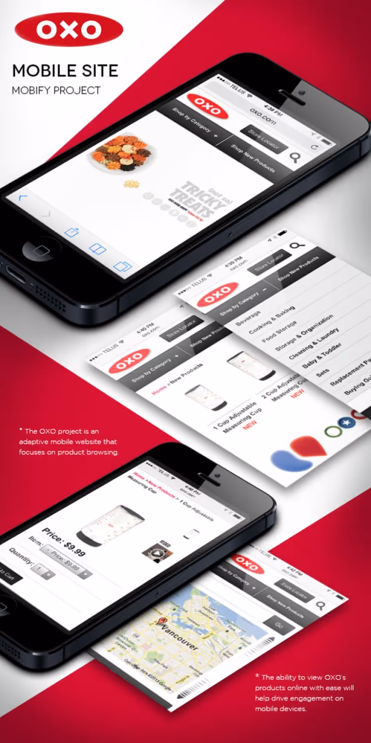
OXO: Adaptive Web Design Example

Skyrocket Digital
Feb 5, 2018
No items found.
Feb 5, 2018
min
No items found.
OXO: Adaptive Web Design Example
No items found.

This adaptive web design is at the heart of beautiful mobile websites. - Skyrocket designs websites with the modern user in mind, which means mobile first. Learn how mobile specific templates can take your user experience to the palms of thousands.

A triumph of Adaptive Web Design (AWD), the OXO.com mobile site features optimized site sections and content prioritized for mobile devices.

We developed a new Information Architecture in collaboration with the team at OXO which, in turn, drove the mobile template design. Adherence to brand standards ensured cohesion between the mobile and desktop sites.

The end result is a mobile experience that loads fast and gives OXO customers exactly what they’re looking for – a quick way to browse OXO products and get to a nearby store!

We implemented Mobify for this particular build, which supplies the custom templates and caches the content for fast load times.

Stay in the Know

Sign up to receive very occasional emails on interesting topics.
Please add an email address
Thank you! Your submission has been received!
Oops! Something went wrong while submitting the form.
All Articles
No items found.

Book a Meeting

Or

Send a Message

Please add your name.
Please enter a valid email address.
Please add a message.
Send
Thank you! Your submission has been received!
Oops! Something went wrong while submitting the form.
No items found.