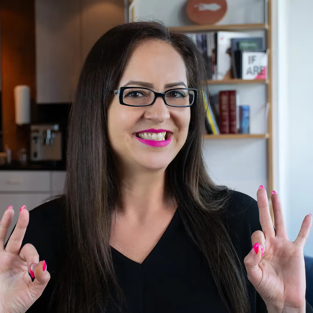
On Wednesday afternoon, February 22, 2017, Vancouver City Council approved a new logo for the City of Vancouver. To say that the new logo was spat out with little regard for the design and no strategy to back it up is to say nothing. Hundreds of members of Vancouver design and digital community have expressed their position on the redesign in an open letter. One of the signatories was our UX Designer Marie Lamouret. Next day, CBC reached out to Marie for an interview, a transcript of which we are publishing below.
Listen to the full interview (7 min. 16 sec.) in French.
Logo of Vancouver: the design community takes offence
Marie Villeneuve (CBC): Vancouver City Council recently voted to change the logo of the city, and the least we can say is that they lacked common sense. Visual elements were deleted; we are only left with the words “City of Vancouver” laid out on two lines in two different colours. This change wasn’t met with unanimity: many of you commented on the change on our Facebook page, and none of the comments were positive. An open letter that opposes this decision has been shared on social media. More than 200 people from the Vancouver digital community have already signed it, amongst them Marie Lamouret, designer at Skyrocket Digital. Hello Marie.
Marie Lamouret: Hello.
MV: What do people have against this new logo?
ML: There are several things. For a start, the need for a new logo wasn’t properly justified by the City of Vancouver. There is also the fact that a logo is supposed to represent values, to showcase values visually. Here, except for the fact that this is a logo for a city called Vancouver, meaning it only shows that the City of Vancouver exists, we are not showcasing any values. There is blue and green, so we can assume there is nature, which was already the case for the old logo. I really think Vancouver represents a lot more than this.
MV: It also resembles the colours of the Canucks?
ML: Yes, it’s almost the same colours.
MV: And what does the open letter that you signed say?
ML: It explains our disappointment with the result and the absence of a good design process. I don’t think they will revisit the logo since it has already been approved, but I hope next time they decide to redesign the logo they will take into account the comments made in the letter.
MV: For people who are not in the design world, Marie, how do you create a logo? How do you usually start? Obviously, it’s a long process?
ML: Yes, it’s a long process. First you have to look at the current logo and understand why it works or doesn’t. What you want to show with a new design are the values of the city or the values of your brand and how you are going to visually get the message across. It doesn’t look like the message evolved between the old and the new logo, but you should have a strategy around it. Here the strategy of the city was just to make sure the new logo would work better on social media—I don’t think the old logo was working badly online, and the new guidelines they published don’t mention how to use the new logo on social media. Also, it was supposed to help people who don’t speak English to better understand Vancouver’s identity, but they removed the symbol next to the wordmark, so only saying “City of Vancouver” in English doesn’t help at all.
MV: People would actually recognize the symbol that was next to the words “City of Vancouver” everywhere, it was part of the identity of the city. Now it’s removed but it wasn’t replaced by anything.
ML: Yes, exactly. It’s only the typography now and…
MV: What font is it?
ML: It’s Gotham. It’s a font that has been used quite a lot already. It’s not very original, but we can still use it—it’s mostly that the guide they published doesn’t explain the reasons behind the choice. There might be a good reason, but it hasn’t been explained. Same thing with the colours—no explanations. They don’t show applications either. We don’t know how it will be applied on brochures or billboards, for example.
MV: Yes, actually we were talking about this here in the office: it’s not only a logo, it’s the identity of a city, which means we are going to see it everywhere—on billboards, city signs—it’s larger than a simple logo.
ML: Yes, totally, you should think about a full strategy and a full visual identity, not just a logo or wordmark without showing how it will be applied in the future.
MV: Some people online pointed out how similar the new logo was with the one for the City of Chilliwack. When you compare both of them, they look pretty much the same.
ML: Yes, I don’t really understand how the designers or the city didn’t notice the similarities between the two. At least the logo for Chilliwack has a symbol next to the words “City of Chilliwack”.
MV: Are there cities you can think of that have inspiring logos?
ML: Sure. The City of Melbourne has a really interesting logo with many versions of different colours and patterns—they represent the diversity of the city well. There is the city of Porto that has a very simple logo but a lot of work was put into iconography. There are icons next to the logo to showcase different activities you can do in the city. I can also think of the logo for Bologna: the symbol shows the city’s old architecture, except the typography and the symbol are contemporary, so it blends the city’s history with modernism at the same time, also showing its attractiveness.
MV: We had examples to get inspired. So there was the open letter, is there going to be something else in the future or are you waiting for the response?
ML: I don’t think the City of Vancouver has responded, but since it has been approved already I don’t think it will change much.
MV: Yes, we’ll see what happens next! Thanks a lot for coming here this morning Marie Lamouret, designer at Skyrocket Digital in Vancouver, thank you Marie.
ML: Thank you!
Update: City of Vancouver has halted the logo rollout. An excellent example of the responsibility of the design community and the importance of speaking up. Let’s see what happens next.

.avif)


