The Newsstand in iOS 6 was the shit. That smooth wood veneer and slightly ominous light casting on the front covers gave me a sense of familiarity, like I was standing in my favourite Chapters (or Barnes & Noble, for US of A folks) scanning for the best tabloid mag to read about who T Swift ripped into for that new catchy song.
What? That was three years ago, and we are already midway through 2016? Unfortunately for fans of skeuomorphism, that ship has sailed. Trends come and go so fast; although I know you don’t always want to let it go—expiration is inevitable. When you’re in the midst of designing a brand new site, and that cool thing you’ve implemented has been deemed old news, it can surely be frustrating.
By now you must be thinking how daunting it is to stay in the loop, but fear not. Anyone can look around and familiarize themselves with what’s cooking. To give you a boost, here are a few trends in the current world of web design.
Full-Width Video Headers
If full-width image headers are all the rage, there’s no reason why videos shouldn’t be. Videos are a powerful tool for storytelling—and isn’t that what every website strives to do? A stunning video can capture our attention just like a movie trailer does. Adding a video to your site can take your audience on a theatrical adventure, convey deeper emotions and capture ideas that a still image would struggle with. I have to be clear though: it can’t just be pretty. Ensure it adds to the CTA, or else it becomes a distraction.
Say your site is selling tickets for that sick band coming to town. The video header you’ve implemented shows an endless loop of the band playing, haphazardly cutting to different angles. It does nothing to entice me into buying tickets. On the other hand, a video that shows fans entering the venue and having a good time watching the band play tells me a story that I want to be a part of.
Material Design
We challenged ourselves to create a visual language for our users that synthesizes the classic principles of good design with the innovation and possibility of technology and science. —Google

Google gave birth to this game changer in 2014. With material design, your experience on your desktop, laptop, tablet and mobile device are in perfect unison. It’s seemingly simple, yet complex and carefully crafted right down to a point of a pixel. Google’s ‘paper and ink’ motto brings familiarity to real-life objects. Material design combines those minimal, clean pieces with its elegant use of animation, transparency and shadows to create an experience that is incredibly easy to follow and satisfying to the touch (or click, or hover).
Interactive Storytelling
Interactive storytelling takes you on an immersive journey. You become part of the animations, the pages, the text and images—you are the protagonist (or maybe the antagonist). Interactive storytelling gives you a reason to keep digging, whether it’s standing up for a cause or pouring yourself a glass of digital beer. Simply exploring websites that incorporate interactive storytelling can be an exciting and fresh or sobering and emotional experience providing audiences of all interests a sense of wonder. Interactive storytelling can add emphasis to any message the site aims to deliver.
and Typography, my favourite trend
Certain fonts demand attention and praise—ask and they shall receive. I absolutely love when designers let the typography speak for itself. Each font is crafted to perfection for a reason. It’s an artform in itself that often ends up being an afterthought to the palette, imagery and content used in a design. Fonts can convey emotions through their shapes, weights and sizes; they are so diverse, reflecting on the personalities of those who brought them to life.
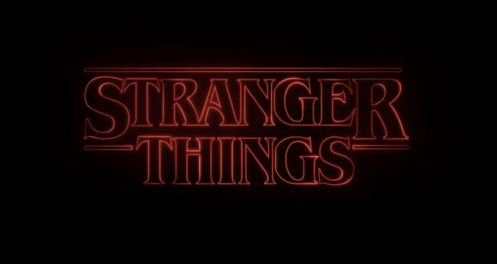
I’m sure all of you have seen it by now: one of my favourite examples of allowing type to stand out on its own is the opening sequence of the Netflix show Stranger Things. With some Drive-esque music playing, the camera glides over the letters that slowly come together. The rich and old school ITC Benguiat goes so perfectly with the contents of the show. There couldn’t have been a better pairing with the ominous red glow. The sequence pays homage to the pulpy 80s that the show takes place in, not to mention all of those Stephen King classics that I’m sure are nostalgic to many. This is the same studio that brought to you the Mad Men opening credits. Enough said.

The reason why I love delving into typography is because… anyone can do it! There are thousands of accessible, quality fonts to choose from. It excites me when sites aren’t afraid to show off their type at 96px with loud, punchy colours. I love seeing classics like Baskerville being used front and centre and demand user's attention. Type has been overlooked in web design, and it’s time to change that. The fonts you choose truly set the tone and voice. After all, written content is the dialogue, the story, the message of the site, and it is ultimately what the users look for.
Inspire and Be Inspired
We’ve only touched up on a mere fraction of what’s currently trending in web design and perhaps, by the time you read this, some of it would already be outdated. As we know, history repeats itself and fashion recycles. Let’s study the trends of the past, but also incorporate current trends and make them our own; or think outside the box for the birth of a new one. We need to inspire and be inspired—that fuels our desire to do more than what we believe we’re capable of. As designers, we learn from each other and grow by passing our knowledge and celebrating accomplishments.
What are you waiting for? Let’s get crackin’!


