.jpg)

The team was asked to rate Sanpellegrino’s rebrand from 1 to 5. It seemed like a simple question. We realized it’s not.
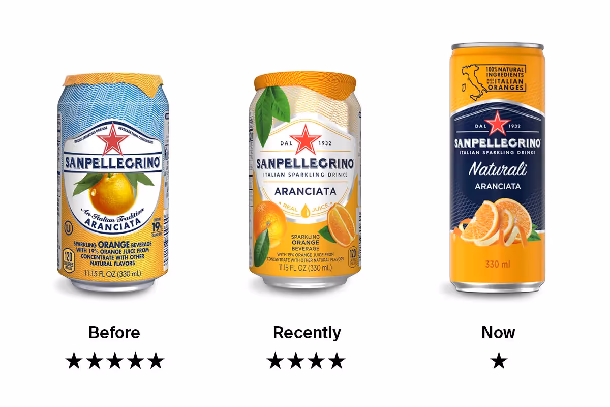
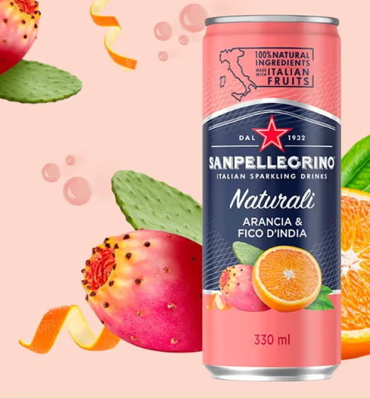
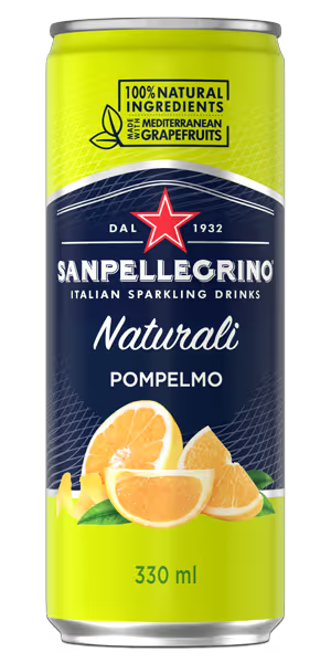
For those of you that haven’t enjoyed the fizzy fruitiness, San Pellegrino is an Italian sparkling mineral water brand known for effervescent flavour and its iconic red star emblem. Now, the brand is transitioning from the traditional barrel can to an 11.15oz can, with an updated design, while still keeping many of their timeless brand elements front and center.
We had no idea that a simple question could spark so much internal debate about the redesign and how to assess it.
"Ah, I see what you did there."
Pablo, our Graphic Designer, was pleased enough about the rebrand:
We see the brand positioning itself in a more premium space without neglecting the fruity elements that had characterized previous designs. The logo on a dark background conveys an image of seriousness: it is less fun, less like a “pop” can, and more of an elevated drink alternative. The change of cans may also be understood as an attempt to spin their classic look into a stylized and refined version.
Less of a rebrand, this is more of a brand evolution from a company that is obviously getting clear about who they are and where they want to live in their customers’ imagination.
"Why’d you change the can. I loved that can."
However, Nick, our Creative Director, was not impressed:
The classic can exuded the utmost charm of the old world; a beautiful hand-drawn illustration of an orange with a picturesque dew drop; an orderly combination of sans-serif and script typefaces, arranged like an Italian movie poster; the intricately interwoven thin wavy lines, that give the feeling of paper currency; and most of all, the crinkly foil top that covers the mouth-piece. The feeling of pulling off that top, and cracking open the can was elevating, like ordering sparkling water when it costs money. In recent years, they’ve taken steps to “modernize” the can—shifting towards photographic elements over illustrated, and looking generally more like something that was designed on a computer. Not that there’s generally anything wrong with computers 🤓. In their latest iteration, they have taken it to the extreme, and the only original element that remains is the logo lockup. Shifting to a taller can normally implies elegance, but getting rid of the foil top results in a net loss, not to mention an increased likelihood of consuming rat droppings. It takes more than slapping on a map of Italy for a product to honour its Italian roots, which the former cans do a much better job of. The new can is generally more serious and less fun. These days, we’ll take all the fun we can get! It would have gotten a better rating if this was the first time we’d seen the product, but in light of its fall from grace, this rebrand gets one star.
Who are we? Why are we here? What’s the meaning of life?
The answer wasn’t as clear cut (it seems strategy never is!), because we started with the wrong question. Here’s the perspective from Mo Dhaliwal, Director of Strategy:
Consumer brands create equity and affinity in spaces they may not realize (which might also explain why Nick’s world has been turned upside down). So, they seldom undertake an update to their branding without taking this into consideration. To really understand this shift in artwork and packaging, we’d need to understand the problem they were trying to solve, or the opportunity they saw. I very much doubt an established brand like this sat down one day and just said ‘let’s switch it up for fun!’ We can infer that there were emotional signals they wanted to send — through imagery, messages, colour theory, form factor, all of it. What are those signals? What did the focus groups say? What other options did the product testing team work through?
Further, the brand managers must have identified a gap or positioning opportunity for them. What was that opportunity? And how would the new product design address that? Opinions about good and bad are much more than face value. We can critique the artwork, because that’s subjective. However, design is art + strategy. Design is meant to solve a challenge. Without knowing what that challenge was, I can’t give this a rating!
So, what’s the right move?
It all depends. Our team members shared multiple perspectives on the Sanpellegrino brand refresh, and all of them are relevant. In fact, it’s the intersection of these perspectives that is so valuable. When making design decisions, they need to be backed by research and strategic insights that align with the product or brand’s goals. That foundation of research and insights fuels the creative energies of our team to produce artwork and design concepts — but, it doesn’t stop there. When our creatives are done, we turn back to strategy: we use tools like UserTesting and Maze. Through focus groups, live interviews, and quantitative surveys, we get a picture of how creative concepts will actually perform in the wild, and that’s where we get to meet people like Mo, Nick and Pablo — those who wonder why you’re doing it, those that hate what you’re doing, and those that get what you’re trying to do!