Designing is more than aesthetics; it's about balancing creativity, inspiration, and consistency. In today’s fast-paced world, this balance is crucial. Imagine embarking on a journey to create a digital masterpiece, only to find yourself fighting a monstrosity of design inconsistencies and repetitive decision-making. This is where a comprehensive style guide and design system comes into play.
In this article, we'll explore the vital role these tools play in web development, how they enhance the whole development process, and why they will be essential for your projects. We will also go through our experience, lessons learned, and best practices to ensure you're fully equipped to harness the power of design systems.
Now, before we start. We know not everyone is familiar with these tools, what they are, how they look or what the differences between them are, so let us first clear that out. Ready? picture this: you're working on a big project, maybe a website or an app, and you want everything to look and feel consistent. You don’t want your buttons looking different on every page or your colours clashing, right? This is where a Style Guide and a Design System come into play, but they serve slightly different roles.
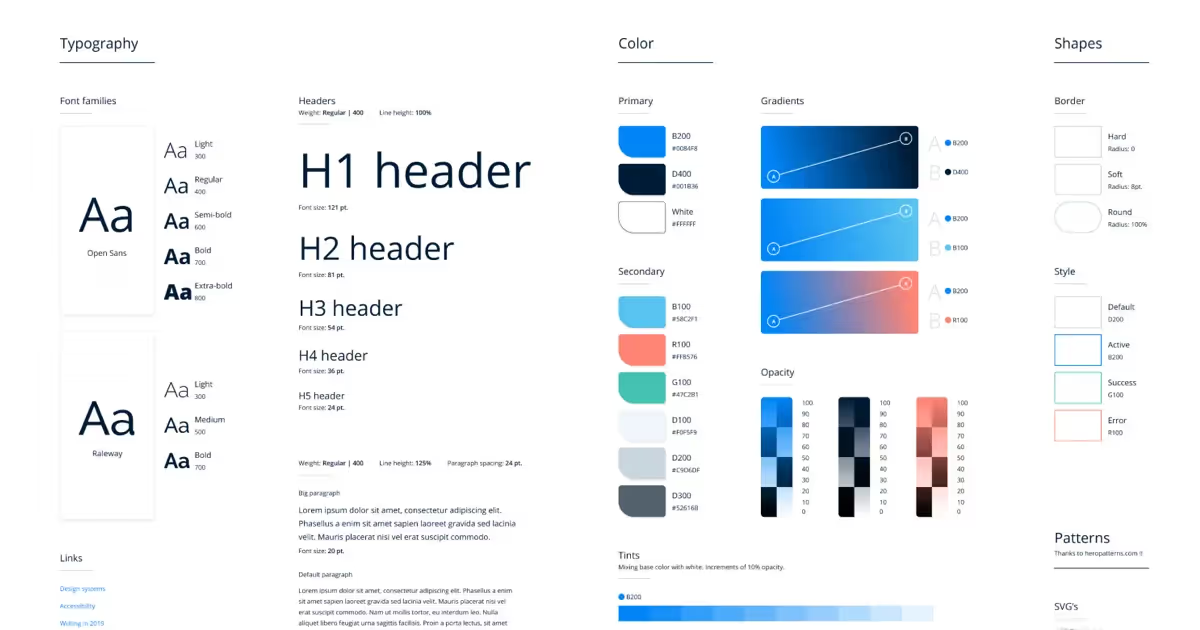
Style Guide: The Visual Blueprint
Think of a Style Guide like the rulebook for your design. It’s all about the visual details—colours, fonts, button styles, logo placement, etc. Imagine you're decorating a house. The Style Guide would be the paint swatches, the fabric samples, and the mood boards that tell you exactly what colour the walls should be, what kind of furniture to use, and where to place everything. It’s a reference that everyone on the team can check to make sure everything looks just right.
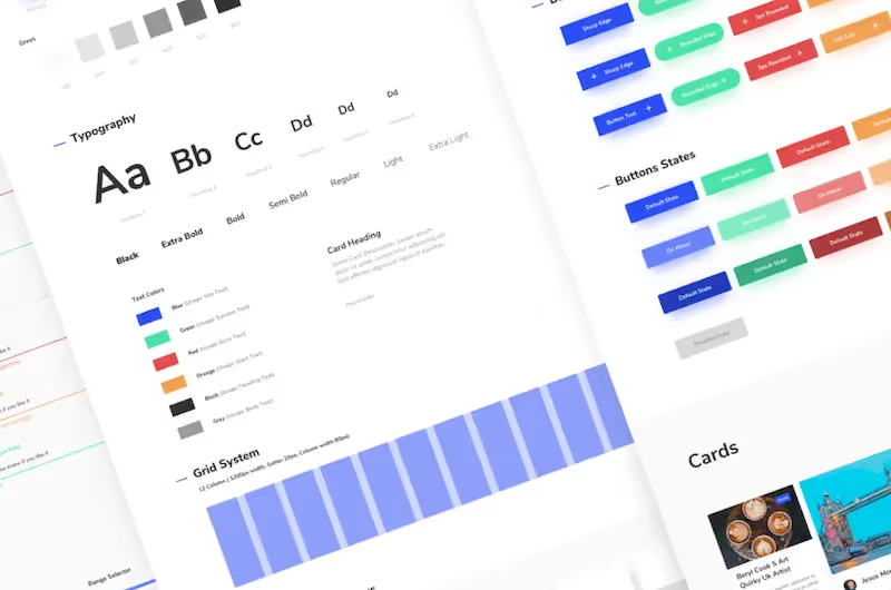
Design System: The Complete Package
Now, a Design System is like taking that Style Guide and cranking it up to eleven. It’s not just about how things look but also about how they function. It includes the visual guidelines from the Style Guide but goes deeper. Imagine it’s like having a pre-furnished house where not only do you know what the couch should look like, but you also know exactly how to assemble it, where it should go in the room, and even how it interacts with the other furniture. A Design System covers everything from code components (like buttons, forms, and navigation) to the processes and principles that guide the team in building out the whole project.
The Key Difference
In short, while a Style Guide gives you the look of your design, a Design System gives you the whole experience—how it looks, works, and evolves. A Design System is a more comprehensive tool, that helps designers and developers work together more efficiently and consistently.
So, if you’re aiming for something that’s easy to scale and maintain, especially on larger projects, a Design System is your go-to. But if you’re just focusing on keeping your design elements consistent, a Style Guide might be all you need.
Now that we’ve cleared that out, let's dive in and unlock the power of design consistency together.
The Importance of a Style Guide and Design System
As we’ve already seen above, creating tools like Style Guides and Design Systems can prove really beneficial, even essential for multiple reasons. These tools can significantly improve development times, make sure everything feels consistent and ensure the success of your projects by maintaining Flexibility, Consistency, Scalability, and ensuring an Effective Implementation. Let’s dive deeper into what this means together:
Flexibility: Ready for Anything
When you have a well-structured Design System in place, you're basically setting yourself up to handle whatever gets thrown your way. Need to add a new feature? Want to redesign a section? No sweat. With predefined styles and components, you can make those changes on the fly without losing the cohesive look and feel of your project. This flexibility ensures your project can grow and evolve while still looking like it all belongs together.
Consistency: Keep It Together
Consistency is the secret sauce of great design. A Style Guide is your go-to for making sure everything looks and feels the same across your entire site or app. It defines your colors, fonts, and components, so everything stays visually harmonious. This isn’t just about making things pretty—it’s about delivering a seamless experience for your users and solidifying your brand’s identity. When everyone on the team follows the Style Guide, you avoid those awkward design inconsistencies that can make your project feel disjointed.
Scalability: Ready to Grow
As your project or team grows, scalability becomes a big deal. A Design System provides the framework you need to easily add or tweak styles and components. This means new team members can jump in without missing a beat, and you can make updates without worrying about messing up the overall design. It’s like having a solid foundation that supports everything you build on top of it, making sure your design stays strong and adaptable as you scale.
Effective Implementation: Work Smarter, Not Harder
Let’s talk efficiency. When you’ve got a Style Guide and Design System in place, you’re not wasting time reinventing the wheel every time you create a new page or feature. Developers can quickly reference the predefined styles and components, which speeds up the process and minimizes errors. Plus, with everyone on the same page, collaboration between designers and developers is smoother than ever. It’s all about working smarter, not harder and delivering top-notch results without the hassle.
Webflow: Our tool of choice
Webflow is more than just a design tool, it's a game-changer for anyone serious about building robust, scalable websites within a low-code environment. Webflow is a low-code platform that allows you to develop state-of-the-art websites with complete design, content strategy and code control including multiple options like a fully integrated CMS and e-commerce solutions that are ready to use. Imagine having the power to design visually stunning, fully responsive sites, all while ensuring pixel-perfect consistency across every component. That’s what Webflow brings to the table.
Webflow has empowered us to rapidly prototype, iterate, and deploy with confidence, and it has gone a step ahead by allowing us to create a full design system that we can use to replicate clean, fast and fully functional websites evert time. From defining reusable styles and components to managing complex interactions, Webflow makes it possible to streamline your entire design process, keeping your projects sharp, consistent, and future-proof. Whether you're a designer or a developer, Webflow has become our secret weapon and allowed us to build a design system that truly delivers.
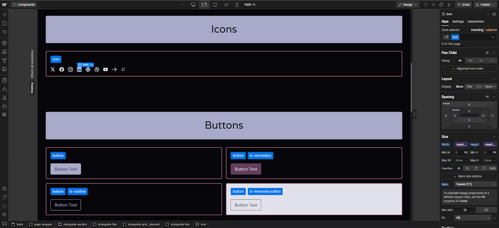
Our Experience: Balancing Flexibility, Consistency, and Simplicity
In our experience, while pre-built design systems are powerful, they can often be overkill for many projects. Most web designs are simple variations of common layouts, and starting from scratch can sometimes be more efficient than adapting a pre-built system, especially when dealing with custom paddings or spacing.
For our Webflow projects, we opted to create our own Design System, focusing on simplicity and flexibility. We set ground rules to avoid unnecessary complexity and we focus on reusability while taking as much advantage as possible over the platform’s tools:
- Less is more: Fewer preset classes, fewer padding options, less of everything.
- Rely on Webflow’s variables: Leverage Webflow’s variable manager for easier project-wide updates.
- Simple naming conventions: Avoid complex multi-level combo classes and adopt the BEM naming convention.
- Out-of-the-box responsiveness: Fonts, spacing, and components designed to be responsive from the start.
These guidelines allowed us to maintain flexibility without sacrificing simplicity, ensuring that our design system was both powerful and easy to use.
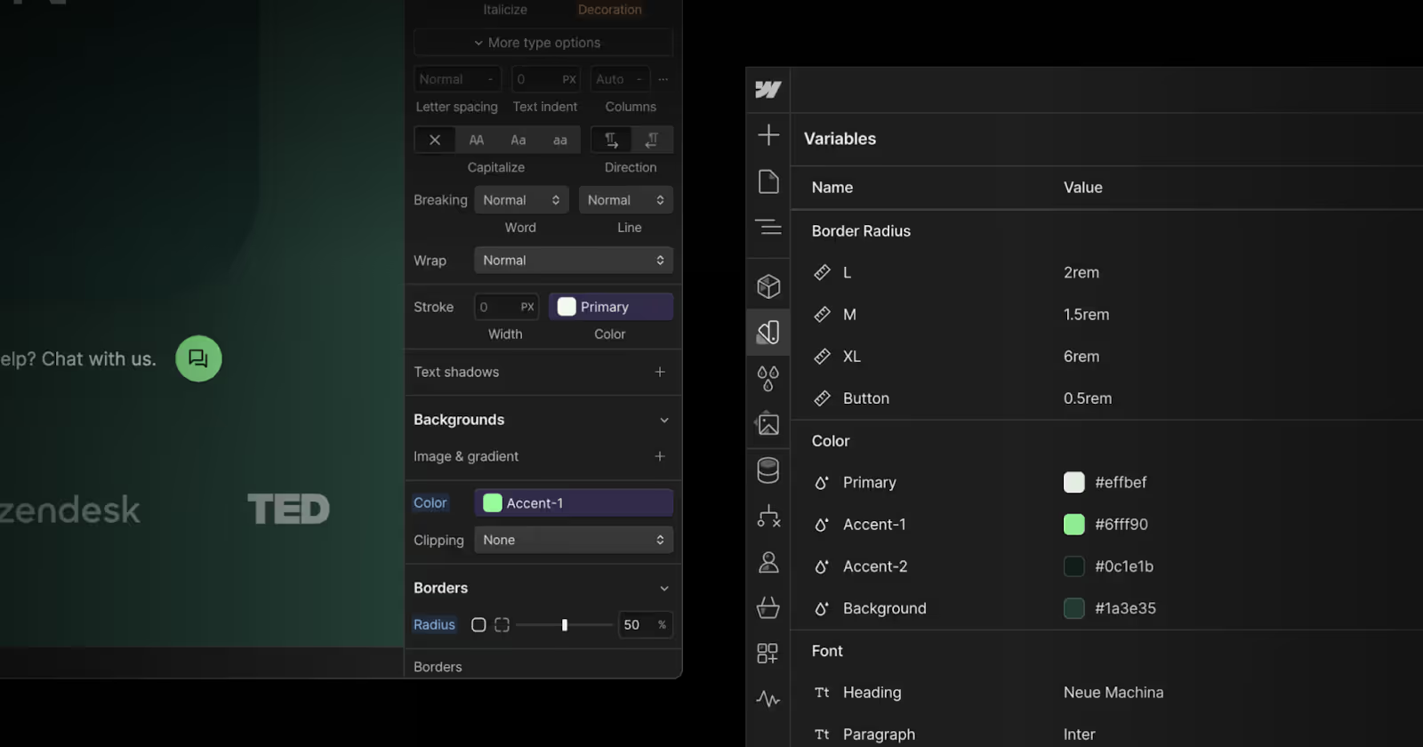
Using Webflow’s Variables for Efficiency
Webflow’s new variables and variable manager have been game-changers for our workflow. While there are limitations (such as the lack of support for breakpoint-specific variables), the ability to store and manage our entire design system within Webflow has simplified our process. It’s far easier to update styles because changes can be made directly from the left menu, and sweeping updates can be done with just a few clicks.
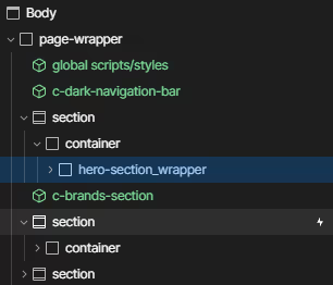
For instance, we use a straightforward naming convention where the page content is wrapped in a page-wrapper, which allows for easy copying and pasting of entire pages. Inside, there is a Section → Container → Content structure. This approach has made it much easier to maintain consistency across the site.
Ensuring Responsiveness and Accessibility
We aimed for maximum responsiveness out of the box. By focusing on desktop, tablet, and mobile font sizes, as well as responsive paddings and spacing, we ensured that our designs looked great on any device. Although Webflow’s variables don’t yet support breakpoint sizes, we created separate variables for each breakpoint, which allows for quick and consistent updates across all devices.
Best Practices: Set Yourself Up for Success
Let’s be real—if you’re diving into design or development without a clear strategy, you’re probably making things harder than they need to be. Whether you're a seasoned pro or just getting started, having a solid foundation is what separates good projects from great ones. A well-thought-out approach isn’t just about doing things right—it’s about making your work easier, faster, and more effective in the long run. So, if you want to elevate your game and consistently deliver high-quality results, these best practices are your roadmap to success.
1. Start Simple: Keep It Clean and Scalable
Don’t overwhelm yourself by trying to create a super complex design system right out of the gate. Start with the basics—a few core components, some essential styles, and a clear set of rules. This approach not only keeps things manageable but also gives you room to grow. As your project evolves, you can add more elements without getting bogged down in unnecessary complications. Simplicity at the start makes scalability a breeze later on.
2. Use Variables Wisely
Tools like Webflow’s variable manager are your best friends when it comes to maintaining flexibility and efficiency. By setting up variables for things like colours, fonts, and spacing, you can make sweeping changes across your entire project with just a few clicks. This doesn’t just save you time—it also ensures that everything stays consistent, no matter how big your project gets. Think of variables as the ultimate shortcut to a more streamlined workflow.
3. Prioritize Consistency
Consistency isn’t just a buzzword—it’s the glue that holds your design together. When everyone on the team sticks to the Style Guide and Design System, you create a unified look and feel that enhances the user experience. This uniformity isn’t just visually pleasing; it also reinforces your brand identity and makes your project feel polished and professional. So, make sure that consistency is a top priority, and watch how it elevates the quality of your work.
4. Test for Responsiveness: Don’t Get Caught Off Guard
Your design needs to look great on every device, from desktops to smartphones. Regularly testing your design on various screen sizes ensures that it’s fully responsive and accessible to all users. This step is crucial for avoiding surprises down the road and ensures that your design shines no matter where it’s viewed. After all, a design that isn’t responsive is a design that’s falling short.
5. Document Everything!
Communication is key, especially in collaborative projects. By documenting every design decision, update, and rule, you create a single source of truth that everyone can refer to. This not only reduces confusion but also ensures that your team is always aligned and working towards the same goals. Good documentation is like a roadmap—it guides your team smoothly through the project and helps avoid any wrong turns.
By following these best practices, you're setting yourself up for a more efficient, effective, and enjoyable workflow. You’ll spend less time fixing issues and more time creating awesome stuff, leading to faster development times and higher-quality outcomes. And let’s be honest, who doesn’t want that?
What’s Next? The Future of Design Systems
Let’s talk about where all this is heading because, like everything in tech, design systems aren’t standing still. As the web development world keeps evolving, so will the tools and techniques we use to create those slick, consistent designs that everyone loves. Here’s the cool part: the future of design systems is looking more automated and integrated than ever.
We’re going to see design systems becoming even more tightly merged into the core of most if not all development platforms. What does that mean for you? Easier implementation, smoother maintenance, and a more seamless experience across all your projects. Basically, the tools you use will be working harder so you don’t have to.
And here’s the kicker—staying ahead in this game means you’ll need to keep experimenting. New tools and approaches are popping up all the time, and those who are willing to test the waters will find themselves leading the charge. Your design system doesn’t just need to be good; it needs to be adaptable, and ready to evolve with the times.
By putting in the work upfront to build a solid Style Guide and Design System, you’re not just setting your current project up for success—you’re future-proofing your workflow. Embrace the magic of design consistency, and get ready to watch your digital masterpiece come to life with a level of finesse and flair that’s second to none. The future is bright, and with the right tools, it will be yours for the taking.


