The next move is yours
We’re ready when you are.
.avif)
Buying a car can be a trip. Our mission was to create a journey, without taking the customer for a ride. CarSimple's design language uses simple lines, contrasts and a bright accent to make every touchpoint useful and delightful.
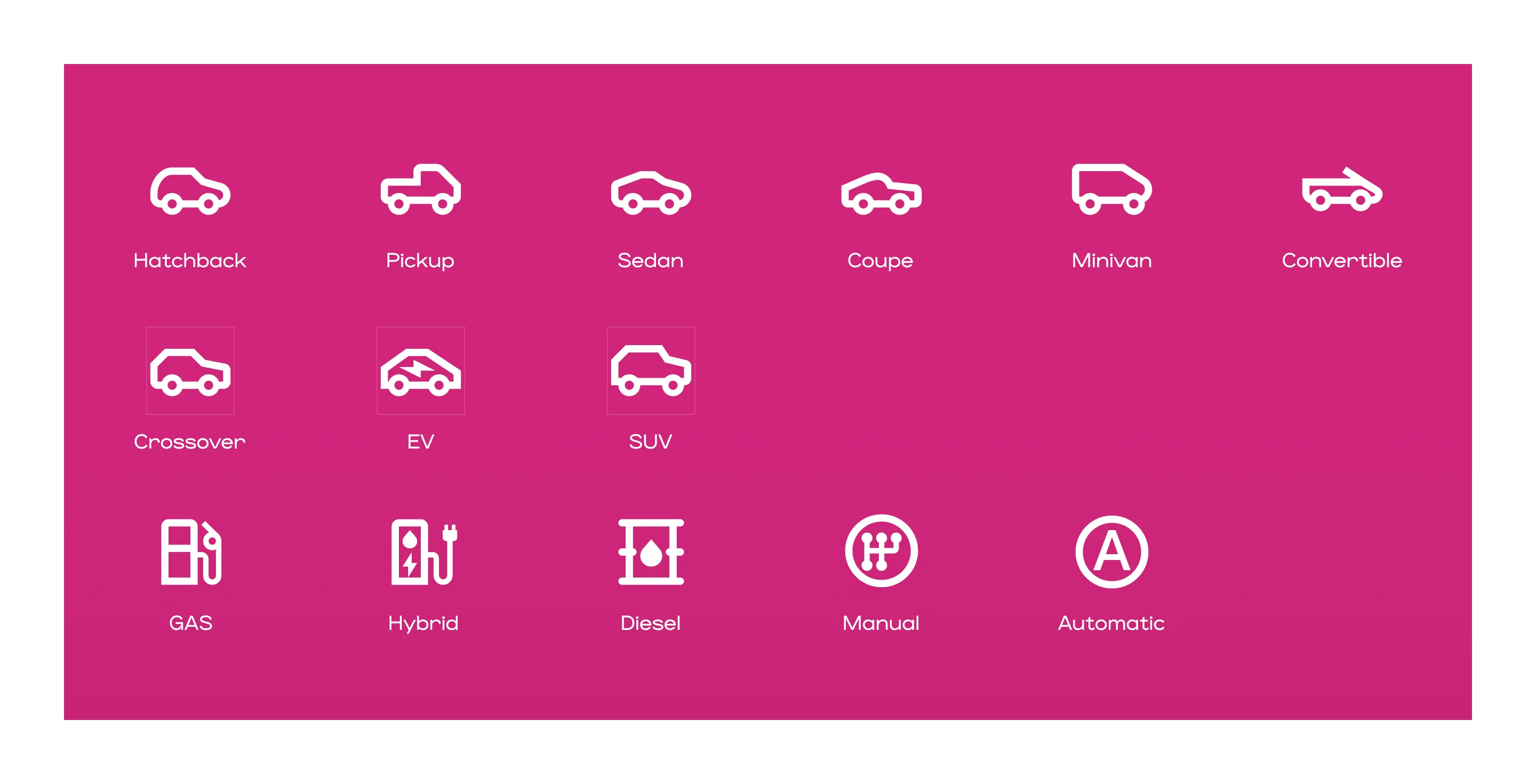
CarSimple's strategy was akin to introducing a zen garden into the chaotic bazaar of used car sales. The approach centered on designing a brand to emanate calmness, trust, and simplicity — a stark contrast to the industry standard. This was not merely about aesthetics but about embedding calm and clarity into the very fabric of the CarSimple identity.By employing a sophisticated design system that leveraged stark contrasts complemented by an atypical accent color, the brand stands out from the cacophony of used car sales. This visual strategy was supported by the use of clear, straightforward iconography, aiming to demystify car ownership and make the process as intuitive as reading a children's book. The design philosophy was clear: to cut through the noise with simplicity, offering a serene harbour for customers in the tumultuous sea of car purchasing and leasing.

.webp)
.webp)
.webp)


.webp)
.webp)
.webp)
.webp)
The result of CarSimple's bold reimagining was a resounding success. The new identity and design system became a lighthouse guiding customers through the noise and friction of car ownership. The carefully chosen contrasts and unique accent color did not just attract attention; they communicated a message of simplicity and reliability.
Users reported feeling a sense of ease and clarity as they navigated the process, a testament to the effectiveness of the calming visual language. The clear iconography served as signposts, ensuring that even those new to car ownership could understand and engage with the process confidently. This transformation has not only elevated CarSimple's brand but has also reshaped customer expectations, setting a new standard for how car sales can be approached. CarSimple is synonymous with trust, simplicity, and a customer-centric approach, proving that even in the most unlikely sectors, change is possible with creativity and a deep understanding of customer needs.

Connect with us for tailored solutions today!

At the heart of our company lies a commitment to integrity, innovation, and collaboration. These values guide our decisions and shape our culture.
We build trust through genuine human connection.
We own outcomes completely. Your goals become ours.
We explore widely, then lead with clear conviction.
We’re ready when you are.